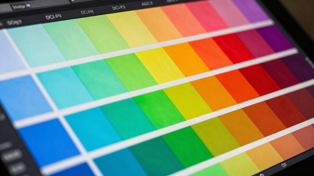
sRGB, AdobeRGB, and DCI‑P3 are key color spaces that determine how colors appear on different devices and mediums. sRGB is standard for web and consumer devices, offering consistency across screens. AdobeRGB covers a wider gamut, making it ideal for printing and photography, while DCI‑P3 is used in digital cinema for richer reds and greens. Understanding these differences helps you select the right space for your project’s needs and guarantees vibrant, accurate results. Discover more to optimize your color workflow.
Key Takeaways
- sRGB is the standard color space for most devices, ensuring consistent colors across screens and print.
- AdobeRGB offers a wider color gamut, ideal for professional photography and design requiring vibrant colors.
- DCI‑P3 is used in digital cinema, providing richer reds and greens for immersive visual experiences.
- Understanding each color space’s coverage helps artists choose the right one for accurate color reproduction.
- Proper color management and calibration are essential for maintaining color fidelity across different workflows.
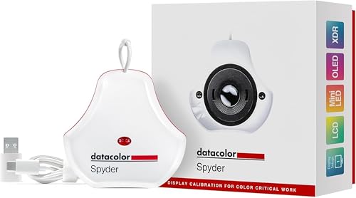
datacolor Spyder – Monitor Calibrator for Graphic Designers, Photographers, and Content Creators, Shows You True Colors, Works on OLED Monitors & LED Screens, Easy-to-Use Color Calibration Tool
Color “Surprises” Are a Thing of the Past: Datacolor’s exclusive DevicePreview TM Beta feature simulates what your photos…
As an affiliate, we earn on qualifying purchases.
As an affiliate, we earn on qualifying purchases.
What Are sRGB, AdobeRGB, and DCI‑P3? An Overview

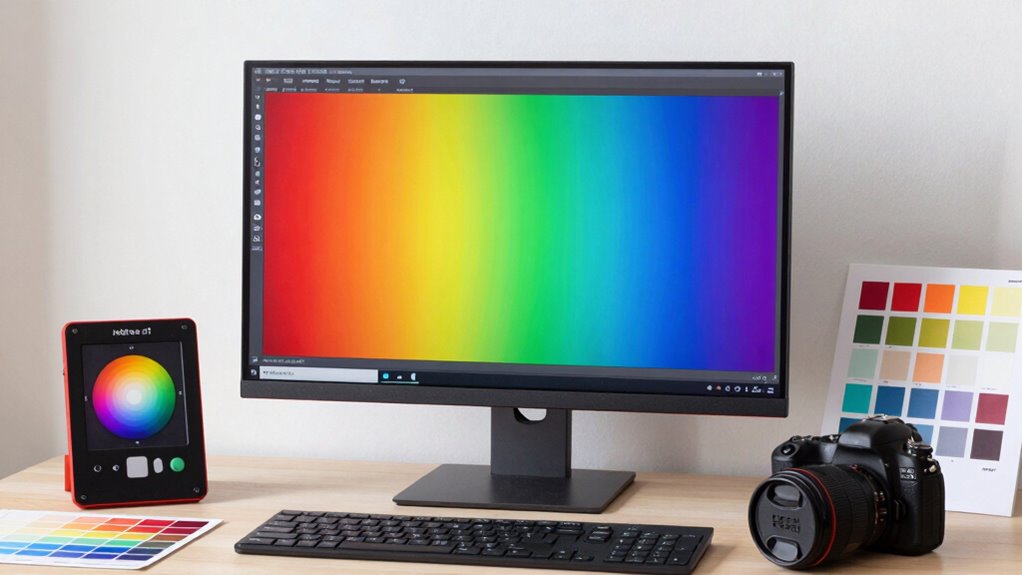
Have you ever wondered why colors look different on various screens or printers? The answer lies in understanding color space comparison. sRGB, AdobeRGB, and DCI‑P3 are the most common color spaces used in digital media. sRGB is the default for most devices and offers a limited but consistent color range. AdobeRGB covers a wider spectrum, especially in green and cyan tones, making it popular among photographers and designers. DCI‑P3 is used in digital cinema and provides even richer reds and greens. To guarantee accurate color reproduction, display calibration is essential, matching your device’s output to these color spaces. Understanding color space coverage helps you choose the right color space for your projects and ensures your colors appear as intended across different devices.
datacolor Spyder – Monitor Calibrator for Graphic Designers, Photographers, and Content Creators, Shows You True Colors, Works on OLED Monitors & LED Screens, Easy-to-Use Color Calibration Tool
Color “Surprises” Are a Thing of the Past: Datacolor’s exclusive DevicePreview TM Beta feature simulates what your photos…
As an affiliate, we earn on qualifying purchases.
As an affiliate, we earn on qualifying purchases.
Comparing Color Gamut Coverage, Brightness, and Volume
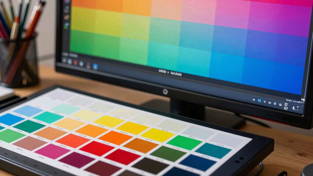
Understanding the differences in color gamut coverage, brightness, and volume is essential for selecting the right display or printer for your work. A wider color gamut means you can display more vibrant and saturated colors, improving color consistency across devices. Brightness impacts how accurately colors are perceived in different lighting conditions, while volume determines the range of colors a device can produce at various brightness levels. When comparing devices, consider how well they maintain color accuracy through proper device calibration. A calibrated device ensures consistent color reproduction and minimizes discrepancies between screens and prints. By evaluating these factors, you can choose equipment that offers ideal color fidelity, helping your artwork stay true to your vision across different platforms and outputs.

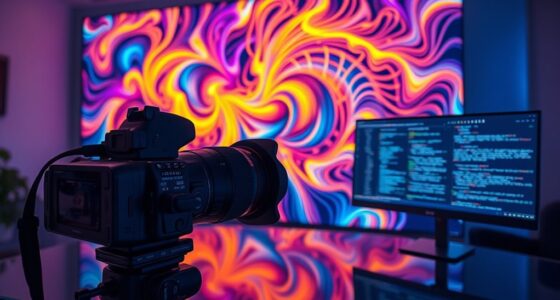
Portkeys PT6 Camera Field Monitor 5.2" 600nit Touchscreen Camera Monitor Vertical Shooting Stretch 3D LUT Output Wide Color Gamut New Peaking RGB Waveform for DSLR
Luma and RGB Waveform: Equipped with three types of high precision oscilloscope functions.Luma Waveform, RGB Waveform and Luma…
As an affiliate, we earn on qualifying purchases.
As an affiliate, we earn on qualifying purchases.
Why sRGB Is the Standard for Web and Consumer Devices

When choosing displays and printers for your work, compatibility across various devices becomes a key consideration. sRGB, or Standard Red Green Blue, has become the dominant color space for web and consumer devices because it guarantees consistent color reproduction across a wide range of screens, cameras, and printers. Its widespread adoption simplifies color management, ensuring your images look the same everywhere. Since most devices are optimized for sRGB, display calibration becomes more straightforward, reducing discrepancies in color appearance. This standardization also minimizes the need for complex workflows, making it easier for artists and designers to produce predictable results. Additionally, understanding Indonesian decor masks can help artists incorporate cultural elements into digital projects with authenticity. Recognizing the contrast ratio of your display can further enhance your ability to judge image quality accurately. Moreover, being aware of color gamut coverage can assist in selecting the right devices for printing and digital display, ensuring your colors remain vivid and true to your original work. The horsepower of electric dirt bikes, for instance, demonstrates how power output can be comparable to traditional bikes, which is crucial for performance considerations. Ultimately, using sRGB ensures your work maintains its integrity across different platforms, making it the practical choice for web-based projects and consumer applications.
![MixPad Free Multitrack Recording Studio and Music Mixing Software [Download]](https://m.media-amazon.com/images/I/71ltIxIuz1L._SL500_.jpg)
MixPad Free Multitrack Recording Studio and Music Mixing Software [Download]
Create a mix using audio, music and voice tracks and recordings.
As an affiliate, we earn on qualifying purchases.
As an affiliate, we earn on qualifying purchases.
When to Use AdobeRGB for Photography and Printing
You should consider using AdobeRGB when your work requires a wider color gamut for richer, more vibrant images. It guarantees better color accuracy in printing, especially with professional printers and materials. Additionally, AdobeRGB integrates smoothly into many workflows, making it ideal for photographers and print artists aiming for high-quality results. Understanding color management is essential to maintaining consistent and accurate colors across devices and outputs. Proper color calibration ensures that colors remain true to your original vision throughout the production process.
Optimal Color Gamut
Have you ever wondered when it’s best to use AdobeRGB for photography and printing? The key is understanding your workflow and display calibration. AdobeRGB’s wider gamut captures more colors, making it ideal when you want to preserve vibrant hues in high-quality images. Use AdobeRGB if your monitor is properly calibrated for color management; this guarantees your colors stay consistent across devices. When editing, a calibrated display helps you accurately visualize how colors will appear in print or on other calibrated screens. If your goal is to achieve the most precise color reproduction, AdobeRGB’s broader spectrum allows for better detail in shadows and highlights. Just ensure your tools and processes support this gamut to fully leverage its advantages without compromising color fidelity.
Printing Color Accuracy
Using AdobeRGB for printing guarantees that the vibrant colors captured in your images translate accurately onto paper. To achieve this, proper color calibration is essential; it guarantees your monitor displays colors consistently with your printer’s capabilities. Monitor profiling plays a vital role by creating an accurate color profile tailored to your specific device, reducing discrepancies between screen and print. When your monitor is correctly calibrated and profiled, you can confidently work within AdobeRGB’s wider gamut, ensuring your prints reflect the richness and detail of your original images. This is especially important for professional photography and fine art printing, where color precision matters. By maintaining consistent calibration and profiling, you minimize color shifts, resulting in prints that truly match your creative vision.
Workflow Compatibility
Choosing the right workflow for AdobeRGB depends on your specific photography and printing needs. To guarantee accurate color reproduction, regular monitor calibration is essential, especially when working within AdobeRGB’s wider color gamut. Proper color calibration helps maintain consistency across your display and print outputs, reducing color shifts that can compromise quality. AdobeRGB is ideal if you’re involved in professional photography and printing where color accuracy matters, as it captures a broader range of colors. When calibrating your monitor, use reliable tools to keep your display’s color profile aligned with your workflow. This ensures that the colors you see during editing match the final printed piece, making AdobeRGB the best choice for high-fidelity color work, provided your hardware supports it and your process is calibrated correctly. Additionally, understanding color spaces is crucial for optimizing your editing process and ensuring your images look consistent across different devices and media.
Why DCI‑P3 Is the Choice for Digital Cinema and High-End Displays

Why is DCI‑P3 the preferred color space for digital cinema and high-end displays? Its wider color gamut captures more vibrant, lifelike colors, making images more immersive and accurate. When comparing color space differences, DCI‑P3 covers about 25% more of the visible spectrum than sRGB, which is essential for high-quality visual experiences. This broader coverage means content looks more vivid on compatible displays. Proper display calibration is necessary to reveal DCI‑P3’s full potential, ensuring colors are reproduced consistently across devices. Artists and filmmakers choose DCI‑P3 because it delivers richer, more precise color rendition, especially in digital cinema. Its ability to maximize color range while maintaining accuracy makes it the ideal standard for high-end visual presentations. Additionally, understanding color space differences helps creators select the appropriate standards for their projects. Recognizing how different color gamuts influence visual fidelity allows for better choices in digital content creation. As technology advances, the importance of color accuracy in visual storytelling continues to grow, making DCI‑P3 a vital tool for professionals.
How to Check and Manage Your Color Space Settings in Workflow
Start by verifying your current color settings in your software to guarantee they match your workflow needs. Next, adjust your software’s color profiles if necessary to maintain consistency across projects. Remember, using a consistent profile helps prevent color shifts and keeps your work accurate from start to finish. Incorporating fostering growth mindsets and mental health can also enhance your creative process by promoting a positive and adaptable mindset throughout your work.
Verify Current Color Settings
Before diving into your project, it’s imperative to verify your current color space settings to guarantee accurate color reproduction. Start by checking your monitor calibration to confirm your display shows true colors. Use your operating system’s color management tools or dedicated calibration software to confirm your monitor’s profile aligns with your workflow. Most design applications allow you to view and adjust color space settings—double-check that they match your intended output, whether sRGB, AdobeRGB, or DCI‑P3. Properly managed color settings prevent color shifts and inconsistencies. Regularly verifying these configurations keeps your workflow consistent and reliable. Remember, accurate color management begins with knowing your current settings and making sure your monitor calibration is up to date.
Adjust Software Color Profiles
Managing your software color profiles is essential for guaranteeing your digital artwork displays accurately across devices. Proper profile management helps you control how colors are interpreted and shown, preventing unwanted shifts in hue or brightness. To adjust your profiles, start by checking your current color calibration settings within your editing software. Most programs allow you to select or assign specific color profiles, like sRGB, AdobeRGB, or DCI‑P3, depending on your workflow needs. If your profile isn’t set correctly, you can usually update it through preferences or color management settings. Regular profile management ensures consistency and accuracy throughout your process, reducing surprises when your artwork is viewed on different screens or printed. Keep your software’s color profiles aligned with your calibration process for ideal results.
Consistent Profile Usage
To guarantee your artwork remains consistent across different stages of your workflow, it’s essential to regularly check and manage your color space settings. Proper profile management ensures your colors stay accurate from creation to output. Start by verifying that your monitor’s color calibration is up to date and matches your workspace profile. Use reliable tools to calibrate your display regularly, maintaining consistent color accuracy. When working with software, confirm that your color profiles are correctly assigned and embedded in your files. Consistent profile usage prevents color shifts and ensures your artwork looks the same across devices and platforms. Regularly reviewing and managing your color profiles keeps your workflow reliable and your final results true to your original vision. Incorporating color management best practices can further enhance the fidelity and consistency of your digital art.
Tips for Ensuring Accurate Colors Across Devices and Mediums
Ensuring that colors remain consistent across different devices and mediums can be challenging, but it’s essential for maintaining the integrity of your artwork. To do this effectively, focus on proper color calibration and profile management. Regularly calibrate your monitors to ensure accurate color display, and use consistent color profiles across devices. This helps prevent color shifts and keeps your work looking true to your vision. Additionally, when exporting files, embed profiles to maintain color fidelity during sharing and printing. Keep your software updated to support proper color management workflows. By taking these steps, you minimize discrepancies and preserve your intended colors throughout your creative process.
- Calibrate your monitors regularly
- Use consistent color profiles
- Embed profiles in your files
- Keep your software updated
Common Mistakes When Working With Multiple Color Spaces: And How to Avoid Them
Working with multiple color spaces can cause unexpected color shifts if you’re not careful, often leading to inconsistencies in your artwork. Common mistakes include neglecting profile conflicts and overlooking potential color mismatches. When you switch between color spaces without proper conversion, colors may appear dull or oversaturated, disrupting your workflow. To avoid this, always assign the correct profile to each document and convert colors properly before moving files between spaces. Here’s a quick comparison:
| Issue | Cause | Solution |
|---|---|---|
| Color mismatch | Inconsistent profiles | Embed or convert profiles |
| Profile conflicts | Overlapping color spaces | Maintain a single standardized profile |
| Unexpected shifts | Improper conversions | Use color management tools |
| Loss of fidelity | Multiple conversions | Minimize conversions and check profiles |
Being aware of color management principles is crucial to maintaining fidelity across projects.
Choosing the Right Color Space for Your Project: A Practical Guide
Choosing the right color space is essential for maintaining color consistency and achieving the desired visual impact in your project. To do this effectively, consider your target medium, color space calibration, and how your color management workflows fit into your process.
- Determine whether your project is digital or print, guiding your choice between sRGB, AdobeRGB, or DCI‑P3
- Confirm your devices are properly calibrated for accurate color reproduction
- Use consistent color management workflows to avoid color shifts
- Match your color space to your audience’s viewing environment for best results
Frequently Asked Questions
How Do Different Color Spaces Affect Print Color Accuracy?
Different color spaces impact print color accuracy by influencing color matching. When you choose the right color space, your monitor displays colors closer to your print results. To guarantee consistency, you need to calibrate your printer regularly. Proper printer calibration aligns your printer’s output with your monitor’s display, minimizing color discrepancies. This process helps you achieve more accurate, predictable colors, regardless of the color space you work in.
Can I Convert Images Between sRGB, Adobergb, and Dci‑P3 Without Quality Loss?
Think of converting images like passing a vibrant rainbow through different filters. You can switch between sRGB, AdobeRGB, and DCI-P3, but the key is ensuring color profile compatibility. While minor shifts may occur, high-quality color conversion tools preserve most of the original hues. To keep your image’s brilliance intact, choose trusted software that prioritizes color conversion quality, so your colors stay as vivid as your vision.
Are There Specific Hardware Requirements for Working With Dci‑P3?
Yes, working with DCI‑P3 requires specific hardware compatibility and display requirements. You need a display that supports the DCI‑P3 color space, with wide color gamut capabilities and accurate color reproduction. Confirm your graphics card and calibration tools are compatible to maintain color accuracy. Without these, you won’t fully utilize DCI‑P3’s benefits, and your workflow could suffer from inaccurate colors or limited display performance.
How Do Color Spaces Impact Video Editing Workflows?
Color spaces profoundly impact your video editing workflow by influencing color grading and overall consistency. Using a well-calibrated monitor guarantees accurate color reproduction, helping you make precise adjustments. When working within a specific color space, your edits stay consistent across devices and platforms. Proper monitor calibration and understanding color spaces allow you to achieve professional-quality results, ensuring your final video looks great everywhere.
Is There a Universal Standard for Color Space Calibration Across Devices?
There isn’t a universal standard for color space calibration across devices. You need to regularly perform device calibration to guarantee color consistency, especially when working across multiple screens or printers. By calibrating your monitors and other devices, you maintain accurate color reproduction, which is essential for consistent results. Keep in mind that different devices may have varying calibration settings, so consistent calibration routines help you achieve reliable color accuracy throughout your workflow.
Conclusion
Just like a master painter chooses the right palette, selecting the right color space guarantees your work shines with true vibrancy. Whether you’re crafting for the web, print, or cinema, understanding these options keeps your colors consistent and engaging. Remember, the magic lies in knowing when to wield sRGB’s simplicity, AdobeRGB’s richness, or DCI‑P3’s cinematic flair. Master your tools, and your creations will speak as clearly as a siren’s call across any medium.