
TL;DR

Get art and craft supplies delivered free with Prime
- Fast, free delivery on millions of items
- Prime Video, Amazon Music and more included
- Member-only deals all year
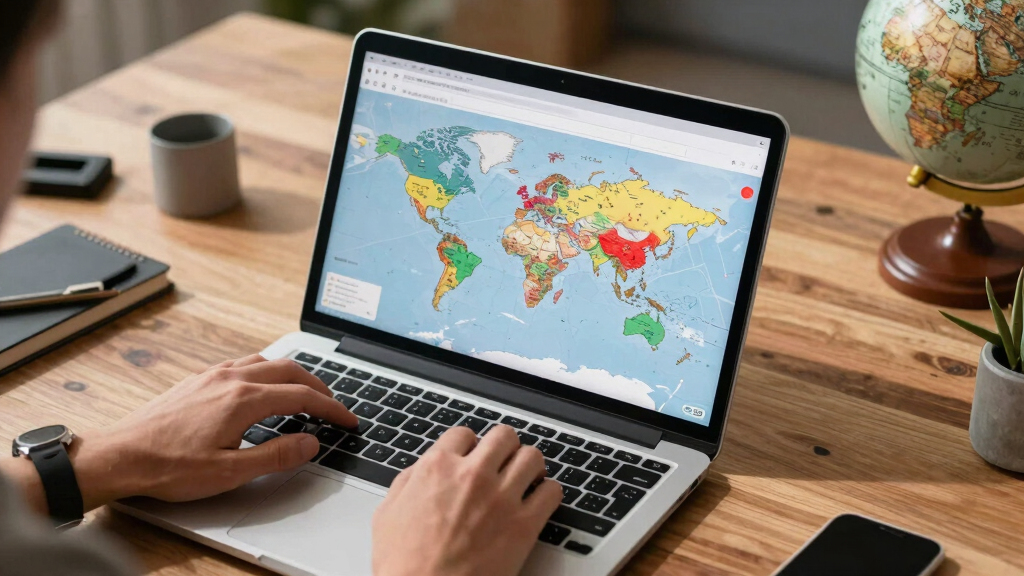
A new map of the world has been generated using Voronoi diagrams based on the closest capital cities, accounting for Earth’s curvature. This redefines territorial boundaries and raises questions about geopolitical perspectives.
A new map of the world has been generated using spherical Voronoi diagrams based on the closest capital cities, redefining territorial boundaries according to proximity. This innovative approach, which accounts for Earth’s curvature, has been shared on Hacker News and is prompting discussions about how geographic perceptions can shift with different mapping techniques.
The map, created from data by Natural Earth and using 1:10m cultural vectors for populated places, calculates regions by determining the closest capital city on a spherical surface. This contrasts with traditional flat map projections, offering a more geodesically accurate depiction of territories.
Developed through computational geometry, specifically spherical Voronoi diagrams, the visualization assigns each point on Earth to its nearest capital city, creating new boundaries that often differ significantly from current political borders. The project is publicly accessible and has garnered attention on Hacker News, sparking debate about its implications for understanding geography and geopolitics.
Implications of Spherical Voronoi Boundaries on Geopolitical Perceptions
This development matters because it challenges conventional political boundaries, which are often based on historical, cultural, or political agreements rather than purely geographic proximity. ‘A space for exploration’ By visualizing territories through the lens of the nearest capital city, it offers a different perspective that could influence discussions on regional identity, resource allocation, and geopolitical strategy.
While primarily a visualization tool, the map highlights how geographic assumptions can be altered by the choice of projection and calculation method, raising questions about the nature of borders and sovereignty. Experts note that this approach could be useful for educational purposes or in geographic analysis, but it is not intended as a political map.
world map with spherical Voronoi diagrams
As an affiliate, we earn on qualifying purchases.
As an affiliate, we earn on qualifying purchases.
Background on Voronoi Diagrams and Geographic Mapping
Voronoi diagrams are a mathematical tool used to partition space into regions based on proximity to a set of points—in this case, the world’s capital cities. Traditionally used in computational geometry, their application to global mapping involves calculating the nearest capital for any given location, considering Earth’s spherical shape rather than flat surfaces.
This method has been explored in niche mapping projects and academic research, but recent online visualization has brought it to broader attention. The project draws from datasets such as Natural Earth’s populated places and employs spherical geometry to produce more accurate regional boundaries based on proximity. 12 Best Art-Themed FIFA World Cup Decorations in 2026
Historically, world maps have relied on projections that distort geography; this approach offers an alternative by focusing on geodesic distances, which could influence how regions are conceptualized or taught. When Francis Bacon Shocked the Art World
“Using spherical Voronoi diagrams provides a more accurate depiction of proximity-based regions on Earth, accounting for curvature that flat maps often ignore.”
— an anonymous researcher on Hacker News
geography educational map globes
As an affiliate, we earn on qualifying purchases.
As an affiliate, we earn on qualifying purchases.
Limitations and Potential Misinterpretations of the Map
It is not yet clear how widely this visualization will influence academic or political discourse. The map is primarily a computational and educational tool, and its practical application in geopolitics remains untested.
There are questions about how to interpret these boundaries, which do not reflect current political borders but purely proximity-based regions. Additionally, the impact of Earth’s irregular geography and population distribution on the map’s accuracy is still being evaluated.
As an affiliate, we earn on qualifying purchases.
Future Uses and Developments in Geospatial Visualization
Further analysis and discussion are expected to explore how such maps can be integrated into geographic education, data analysis, or even policy debates. Developers may refine the visualization, incorporate more datasets, or compare it with traditional political maps to assess differences.
Research into how proximity-based boundaries influence perception and decision-making could also be a future focus, alongside potential applications in regional planning or resource management.
interactive world map for students
As an affiliate, we earn on qualifying purchases.
As an affiliate, we earn on qualifying purchases.
Key Questions
How does the spherical Voronoi map differ from traditional world maps?
It calculates regions based on the closest capital city on a spherical surface, which accounts for Earth’s curvature, unlike traditional flat projections that often distort distances and borders.
Can this map be used for political purposes?
No, it is primarily a visualization and educational tool. It does not reflect current political borders or sovereignty but offers a different perspective based on proximity.
What data sources were used to create this map?
The map uses data from Natural Earth, specifically the 1:10m cultural vectors for populated places, combined with computational geometry techniques.
Will this approach replace traditional maps?
It is unlikely to replace traditional maps but may complement them by offering alternative ways to visualize geographic relationships and proximity.
What are the main limitations of this Voronoi-based map?
It does not account for political borders, population density, or geographic features beyond proximity to capitals, which limits its direct applicability for political or demographic analysis.
Source: Hacker News
Halloween Picks
halloween
As an affiliate, we earn on qualifying purchases.