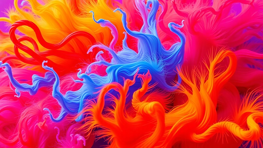

Using bold and bright colours in photographs instantly grabs attention and makes your images more striking. Vibrant hues can highlight key subjects and create emotional impact, guided by the principles of colour theory. Experiment with complementary and monochromatic schemes to add depth and sophistication. Mastering these color choices will help you craft compelling visuals that resonate. Keep exploring, and you’ll discover how strategic colour use elevates your photography even further.
Key Takeaways
- Using bold, bright colours enhances visual impact and makes photographs more memorable.
- Colour theory guides effective pairing of vibrant hues to evoke specific emotions.
- Techniques like complementary colours boost contrast and focal points in images.
- Intentional colour choices support storytelling and emotional resonance in photography.
- Practicing colour combinations improves confidence and mastery in creating compelling visuals.
Have you ever wondered how some photos instantly grab your attention? It’s often because of the bold and bright colours that make an image pop. When you use vibrant hues intentionally, you tap into colour theory, which is the study of how colours interact and influence emotions. Colour theory guides you in choosing combinations that create a strong visual impact, making your photos more compelling and memorable. Bright colours naturally draw the eye, so understanding how to balance and pair them can turn an ordinary shot into something striking. You don’t need to be a professional to harness this power; it’s about knowing which colours evoke certain feelings and how they work together to catch attention.
Bold, bright colours instantly grab attention by creating visual impact through colour theory.
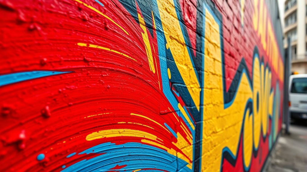
Using bold and bright colours effectively can elevate your photography by emphasizing specific subjects or creating mood. For instance, a shot with vivid reds and oranges can evoke warmth or excitement, while cooler blues and greens might bring calmness or serenity. When you understand the principles of colour theory, you learn how complementary colours—those opposite each other on the colour wheel—can make each other stand out more. This technique amplifies the visual impact, ensuring your viewer’s gaze stays on the focal point. Conversely, monochromatic schemes with a splash of brightness can add sophistication while still being eye-catching. By experimenting with different colour combinations, you can guide your audience’s emotions and focus, making your images more powerful.
In practice, incorporating bold colours into your photography isn’t just about choosing bright hues at random. It’s about intentionality—knowing which colours will enhance your story and resonate with viewers. For example, a landscape shot with a bright yellow sunflower against a deep blue sky creates a vibrant contrast that’s hard to ignore. Similarly, using vivid colours in portrait photography can highlight expressions or details, adding depth and energy to the image. When you master the art of mixing bright colours with your composition, you create a visual impact that’s both immediate and lasting. It’s about striking a balance where colours uplift your message without overwhelming the viewer. Additionally, understanding personal empowerment can help you develop the confidence to experiment boldly with colours and techniques.
Ultimately, understanding how colour theory influences the visual impact of your photos empowers you to craft images that command attention. Bold and bright colours are tools you can wield to evoke emotion, highlight key elements, and make your photography truly stand out. The more you experiment with colour combinations, the better you’ll become at creating images that not only catch the eye but also leave a lasting impression. With practice, you’ll discover how vibrant hues can transform your photography into a compelling visual language that speaks directly to your audience’s heart.
Frequently Asked Questions
How Do Lighting Conditions Affect Bold Color Photography?
Lighting conditions considerably impact bold color photography. You’ll notice that natural light, with its variable color temperature, often enhances vibrant hues, especially during golden hour. Artificial lighting, depending on its color temperature, can either warm up or cool down your colors, affecting their brightness and saturation. To capture bold, bright colors, you should carefully choose your lighting source and monitor how natural versus artificial light influences the overall vibrancy of your shot.
What Camera Settings Optimize Bright Color Capture?
To optimize bright color capture, you should increase your camera sensor sensitivity (ISO) to brighten the image without losing detail. Additionally, adjust the white balance to enhance vividness and accurate color reproduction. Use a wider aperture for more light and set your shutter speed accordingly to avoid overexposure. These settings work together to guarantee bold, vibrant colors come through clearly and intensely in your photos.
Can Post-Processing Enhance Bold Colors Without Distortion?
Yes, you can enhance bold colors through post-processing without distortion by adjusting color saturation and color grading. Increase saturation carefully to make colors more vibrant without overshooting, which can cause unnatural looks. Use color grading to fine-tune hues and contrast, ensuring the boldness remains natural and eye-catching. This approach allows you to emphasize bright colors effectively while maintaining the image’s overall integrity and visual appeal.
Which Color Combinations Create the Most Striking Images?
You’ll find that high-contrast color combinations, like blue and orange or purple and yellow, create the most striking images. Using color psychology, these pairs evoke strong emotions and grab attention. Focus on color harmony to balance bold hues, ensuring your image remains visually appealing. Experiment with complementary and analogous colors to achieve vibrant, eye-catching results that stand out and communicate your message effectively.
How Do Different Cultures Interpret Bright Colors in Photography?
Think of colors as a language—different cultures interpret bright hues through their unique symbolism. In some regions, red signifies luck and prosperity, while in others, it may symbolize danger. Regional palette preferences shape these perceptions, influencing how you capture and present vibrant images. By understanding cultural symbolism, you can create photographs that resonate deeply, honoring diverse interpretations and enriching your visual storytelling with meaningful color choices.
Conclusion
So, next time you pick up your camera, embrace those bold and bright colours. Don’t be afraid to push the limits and make your photos pop, just like a 1960s comic book come to life. Remember, capturing vibrant hues can transform an ordinary shot into a stunning masterpiece. Channel your inner artist and let your images shine with energy and personality—after all, the world’s too beautiful to shoot in dull shades.