White balance can trick your camera into showing inaccurate colors, especially with artwork. To get true colors, avoid relying on auto settings—use manual white balance and calibration tools like gray cards or color checkers. Adjust settings precisely to match your lighting, and correct any discrepancies in post-processing. Consistent calibration of your monitor and lighting setup also helps. Keep exploring, and you’ll discover effective ways to guarantee your art photos reflect your work authentically.
Key Takeaways
- Use manual white balance settings and calibration tools like gray cards for accurate color representation.
- Avoid auto white balance to prevent unpredictable color shifts during shooting.
- Calibrate your monitor regularly to ensure the displayed colors match true artwork colors.
- Adjust white balance using hue, tint, and custom presets based on lighting conditions for precise control.
- Post-process with neutral references to correct any color cast and achieve true-to-life colors.
How White Balance Affects Color Accuracy in Art Photography
White balance plays a crucial role in guaranteeing that the colors in your art photos are accurate and true to life. It controls the color temperature, which affects whether your images appear warm or cool. Misadjusted white balance can make colors look unnatural, skewing the viewer’s perception of your artwork. Using white balance presets, like daylight, cloudy, or tungsten, helps you quickly match the lighting conditions and maintain color consistency. Adjusting white balance correctly ensures that reds, blues, and yellows are rendered faithfully, preserving the artist’s original intent. When you set the right white balance, your photos reflect the true vibrancy and subtlety of your work, making your art more compelling and authentic to viewers. Proper white balance calibration is essential for accurate color reproduction, which is key to maintaining artistic integrity, and understanding how white balance impacts your images allows for better control of your visual output. Additionally, utilizing tools like calibration devices can further enhance color accuracy in your photography. Being aware of lighting conditions and how they influence white balance settings can help you achieve more consistent results across different shooting environments.
How to Spot White Balance Errors in Your Artwork Photos
Identifying white balance errors in your artwork photos can be straightforward if you know what to look for. Watch for color casts that seem unnatural or inconsistent with the scene. Here are key signs to spot:
Spot white balance issues by noticing unnatural color casts and inconsistencies in your artwork photos.
- Uneven lighting consistency across different areas of your photo.
- Skin tones that appear too orange, blue, or green.
- Colors that clash or look washed out, especially in shadowed or highlighted sections.
- Unusual color shifts that don’t match your artwork’s true palette, often caused by camera sensor misinterpretation.
These issues often stem from incorrect white balance settings affecting your camera sensor’s perception. Recognizing these signs helps you identify errors quickly, ensuring you can correct them before finalizing your image.
Practical Techniques for Achieving True Colors Beyond Auto White Balance
To get true colors in your art photos, you should consider using manual white balance settings instead of relying on auto. This gives you more control over the color temperature and helps prevent unwanted color casts. Additionally, calibrating your camera with color targets guarantees your colors are accurate and consistent across different lighting conditions.
Use Manual White Balance
Manual white balance gives you precise control over the colors in your art photos, allowing you to achieve true-to-life results that auto settings often miss. By adjusting the color temperature manually, you can match the lighting conditions perfectly. Avoid relying solely on white balance presets, which may not reflect your specific environment. Instead, take charge with these techniques:
- Set a custom white balance based on your light source’s color temperature.
- Use a gray card or neutral target for accurate calibration.
- Adjust white balance settings directly on your camera for nuanced control.
- Keep a note of your ideal color temperature for different lighting conditions to streamline future shoots.
Being aware of media literacy can help you better interpret the colors and tones in your photos and ensure your artwork appears as intended.
This approach ensures your colors stay true, enhancing your artwork’s authenticity.
Calibrate With Color Targets
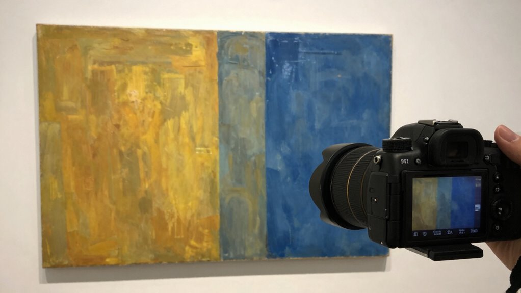
Calibrating with color targets offers a reliable way to achieve true-to-life colors that auto white balance often misses. By using a color target during your shoot, you provide a reference point for accurate color reproduction. You can then compare your images with calibration charts or software to adjust your camera’s color settings precisely. This process guarantees that the colors in your art photos reflect the actual hues of your subject, not just what your camera’s auto white balance interprets. Incorporating calibration charts into your workflow helps eliminate color cast errors and guarantees consistency across multiple shots. Additionally, understanding color management is essential for maintaining color accuracy throughout your editing process. Proper color calibration ensures your monitor and camera work in harmony, giving you confidence that your photos display the authentic colors you intended, making your art stand out with true, vibrant hues. To further refine your workflow, learning about white balance techniques can help you adapt to different lighting conditions and improve color fidelity in various environments. Recognizing how large numbers are represented and converted can also aid in precisely managing your color data, especially in detailed technical work.
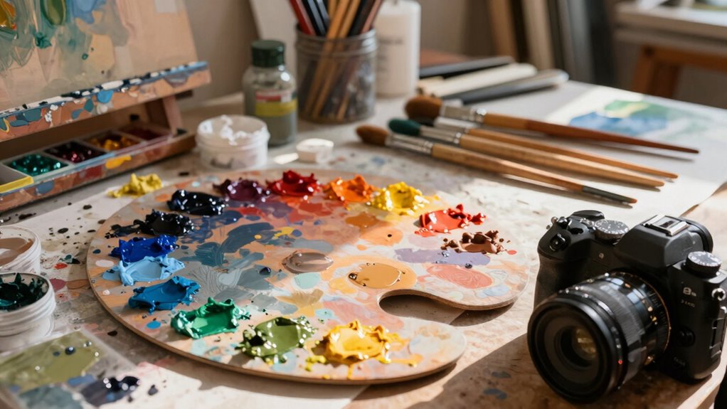
Manual Settings and Tools to Capture Accurate Colors

Achieving accurate colors in art photography often relies on adjusting your camera’s settings and using specialized tools. By mastering manual controls, you gain more artistic expression and can better communicate color psychology. Here are key tools to help you capture true colors:
Master manual controls and calibration tools to capture authentic, true-to-life colors in your art photography.
- Manual White Balance – Set it yourself to match your lighting conditions precisely. Understanding the mechanics of white balance can help you avoid common color cast issues. Additionally, knowing how lighting conditions influence color temperature can improve your white balance adjustments.
- Custom Camera Profiles – Create profiles tailored to your art’s color palette for consistency.
- Gray Cards and Color Checkers – Use these tools to calibrate your camera’s perception of neutral tones.
- Histogram and Zebras – Employ these visual aids to monitor exposure and prevent color distortions.
- Understanding Color Science – Familiarity with how colors are perceived and reproduced helps in making informed adjustments to ensure your photographs reflect true colors. Recognizing the camera’s color processing capabilities allows for more accurate color management.
Correcting Color Discrepancies in Post-Processing
Even with carefully set camera settings, some color discrepancies can still slip through due to lighting variations or camera limitations. To correct these issues, focus on guaranteeing lighting consistency during your shoot. In post-processing, start by calibrating your monitor to guarantee it displays accurate colors; this step is vital for precise adjustments. Use software tools like white balance sliders or color correction layers to fine-tune your images. Pay attention to neutral tones and compare them to real-life references to verify accuracy. Adjust hue, saturation, and luminance carefully to match the original artwork’s true colors. Remember, post-processing is about refining what the camera captured, so accurate monitor calibration and awareness of lighting conditions are essential for achieving authentic, vibrant art photos. Additionally, understanding color calibration can help ensure your edits are based on true-to-life color representations. Incorporating knowledge of lighting consistency can further improve your color correction process, leading to more reliable and true-to-life results.
Tips for Consistent, Vibrant Art Photos That Truly Reflect Your Work

To guarantee your art photos stay consistent and vibrant, mastering manual white balance is key, so your colors stay true across shoots. Using color calibration tools can help you achieve accurate results and maintain quality over time. Don’t forget to fine-tune your images in post-processing to perfect the colors and reflect your work accurately. Being aware of ethical considerations in digital editing ensures you present your artwork honestly and responsibly. Additionally, understanding public perception of authenticity in digital art can influence how you choose to display and edit your work. Incorporating tools like a vetted calibration device can further enhance your color accuracy and overall image fidelity, helping you create a more professional presentation. Employing a holistic SEO approach by optimizing your workflow and tools can also improve your overall image quality and visibility.
Master Manual White Balance
Wondering how to get your art photos to look consistent and true to your work? Mastering manual white balance is key. It ensures lighting consistency and accurate color reproduction by giving you full control over your camera’s settings. Here are four tips to help you:
- Use a gray card or white balance card for calibration before shooting.
- Set your white balance manually in-camera for each lighting condition.
- Avoid auto white balance, which can shift colors between shots.
- Regularly check and adjust your camera calibration to maintain color accuracy.
- Be mindful of environmental factors like dust particles, which can affect indoor air quality and potentially influence the lighting conditions you rely on for accurate color capture. Proper sensor maintenance can also help ensure your camera captures colors faithfully.
Use Color Calibration Tools
Using color calibration tools is vital for achieving consistent and vibrant art photos that accurately reflect your work. These tools help you establish a reliable color calibration process, ensuring your camera’s white balance aligns with real-world colors. By using a calibration target or gray card, you can set a custom white balance that minimizes color shifts caused by different lighting conditions. This step is crucial because auto white balance often misinterprets colors, leading to dull or inaccurate results. With proper color calibration, your photos will display true hues, making your artwork stand out. Regular calibration also maintains consistency across multiple shots, so your portfolio remains cohesive. Ultimately, investing in color calibration tools saves you time in editing and guarantees your art’s colors are as vibrant and true as possible.
Adjust in Post-Processing
Once you’ve calibrated your camera and set a solid white balance during shooting, fine-tuning your images in post-processing guarantees your artwork’s colors stay true and vibrant. Adjusting the color temperature helps correct any lingering color casts, ensuring the hues match your artwork. Use white balance presets as a quick starting point, but don’t hesitate to refine manually for accuracy. Focus on these key steps:
- Fine-tune the color temperature to match your artwork’s true colors.
- Use a white balance eyedropper tool to select neutral tones within your image.
- Adjust tint and exposure to maintain consistent, vibrant hues.
- Preview your edits on calibrated monitors for accurate color representation.
These steps ensure your art photos reflect your work’s vibrancy and authenticity.
Frequently Asked Questions
How Does Ambient Lighting Influence White Balance Accuracy?
Ambient lighting considerably influences white balance accuracy because different light sources have varying color temperatures. When you shoot in mixed or uneven lighting, your camera struggles to determine the correct white balance, causing color shifts. To get true colors, you should adjust the white balance setting based on the ambient light or use manual correction. Recognizing the impact of light source and color temperature helps you capture more accurate, true-to-life art photos.
Can Lens Quality Impact Color Fidelity in Art Photography?
Yes, lens quality can impact color fidelity in art photography. Poor lens glass may introduce color casts or distortions, making your images less accurate. To combat this, verify your camera’s sensor calibration is correct and use a consistent color profile. High-quality lenses minimize these issues, helping you capture true colors. Regular calibration and choosing the right lens are essential for maintaining color fidelity in your artistic photos.
What Are Common Mistakes When Setting White Balance Manually?
Think of white balance calibration like tuning a musical instrument—you want harmony, not discord. Common mistakes include not adjusting for different light sources or relying solely on auto settings. When setting white balance manually, avoid guesswork; instead, focus on accurate color temperature adjustment. Failing to do so can lead to strange color casts, making your art photos look off. Always double-check your settings to keep your colors true.
How Often Should I Recalibrate My Camera for Color Accuracy?
You should recalibrate your camera’s sensor calibration and update your color profiling at least once every few months, especially if you notice color inconsistencies or change lighting environments often. Regular calibration ensures your camera captures true colors accurately. Keep in mind that different lighting conditions may require specific profiles, so re-calibrate whenever you switch to markedly different light sources to maintain color fidelity in your art photos.
Are There Specific White Balance Settings for Different Art Mediums?
Yes, you should modify white balance settings based on different art mediums and light sources. For example, if you’re photographing paintings under warm incandescent lighting, set your camera to a higher color temperature, like 3000K, to match the light source. For cooler fluorescent lights, lower the color temperature for accurate colors. Custom white balance helps ensure your art photos reflect true colors, regardless of the light source.
Conclusion
Remember, a picture is worth a thousand words, but only if it shows your artwork’s true colors. Don’t rely solely on auto white balance—it can deceive you. Take control with manual settings and post-processing tweaks to guarantee your photos reflect your art’s real vibrancy. As the saying goes, “Beauty is in the eye of the beholder,” so make sure your viewers see what you truly see by mastering white balance.