
To master color management, start by choosing the right color spaces (like Adobe RGB) for your workflow, then calibrate and profile your devices regularly to guarantee accuracy. Embed color profiles into your files, and use consistent settings across monitors, printers, and web. Avoid skipping calibration and troubleshoot discrepancies promptly. Follow this simple process, and you’ll produce consistent, vibrant colors across all media—plus, you’ll uncover even more tips to perfect your workflow.
Key Takeaways
- Use calibrated monitors and consistent profiling to ensure accurate color display across devices.
- Select and embed appropriate color profiles during editing to maintain color fidelity.
- Regularly calibrate and profile devices to prevent color drift and ensure reliable output.
- Apply proper color space settings in software, like Adobe RGB or sRGB, based on workflow needs.
- Validate and troubleshoot color accuracy routinely to identify and correct discrepancies promptly.
monitor calibration tool
As an affiliate, we earn on qualifying purchases.
As an affiliate, we earn on qualifying purchases.
What Is Color Management and Why Is It Important?
Color management is the process of ensuring that colors are accurately represented across different devices and media. It directly influences your color perception, making sure what you see on one screen matches what others see on theirs. Understanding color psychology is essential because colors evoke emotions and influence how your message is received. Without proper management, colors can appear inconsistent, leading to miscommunication or a less professional look. Whether you’re designing a website, editing photos, or printing materials, color management helps maintain consistency and trust in your visuals. It allows you to control how colors are displayed, helping you communicate your intended mood or message effectively. Additionally, understanding color calibration techniques can significantly improve the accuracy of your color reproduction. Implementing standardized workflows used by professional workflows ensures that your color output remains reliable across various platforms. Ultimately, mastering color management ensures your visuals look great and convey the right psychological impact.

Datacolor SpyderExpress – Easy Monitor Calibration for Photo, Design & Content Creation, Supports MacBook M4 mini-LED, Calibrates 3 Displays, Fast 90-Second Setup, Upgradeable Software
QUICK & EASY COLOR CALIBRATOR: Whether you're editing photos, designing graphics, or producing content, SpyderExpress helps you view…
As an affiliate, we earn on qualifying purchases.
As an affiliate, we earn on qualifying purchases.
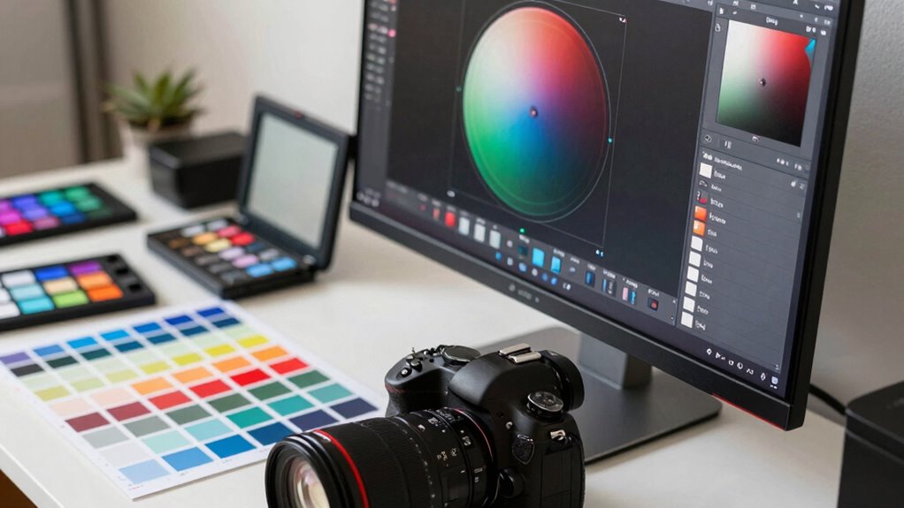
Mastering Color Spaces and Profiles for Accurate Colors
You need to select the right color spaces to match your workflow and output. Applying accurate color profiles guarantees your colors stay consistent across devices and media. Mastering these choices helps you achieve true, reliable colors in every project. Incorporating color management tools allows for more precise control and consistency throughout your editing process. Understanding how contrast ratio impacts image quality can also influence your calibration and display choices, ensuring a balanced and vivid visual experience.
Choosing Proper Color Spaces
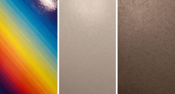
Choosing the right color space is essential for guaranteeing your images display accurately across different devices and mediums. Your success hinges on proper color space selection, which impacts how colors stay consistent from creation to output. To do this effectively, consider profile compatibility—make sure your chosen color space works seamlessly with your editing software and intended output devices. Using incompatible profiles can lead to color shifts or loss of detail. For example, sRGB is ideal for web use, while Adobe RGB offers a broader color range suited for printing. By selecting the appropriate color space based on your workflow and final medium, you ensure your colors stay true and vibrant throughout every stage of your project. This mindful choice simplifies your process and improves your results.
Applying Accurate Color Profiles
To achieve consistent and true-to-life colors, applying the correct color profiles to your images is indispensable. Proper color profile selection ensures your device communicates colors accurately across different software and hardware. Start by choosing the right profile for your workflow—sRGB for web, Adobe RGB for print, or ProPhoto RGB for high-end editing. When you embed or assign the appropriate color profile, you enhance color accuracy, reducing discrepancies between your screen and final output. Always verify your profile settings before exporting or printing to maintain consistency. This step is crucial for color accuracy enhancement, especially when working across multiple devices or sharing files. By carefully applying accurate color profiles, you guarantee your images display their intended colors reliably, fulfilling your goal of professional, consistent results. Additionally, understanding color spaces and profiles is essential for mastering color management in your workflow.

Calibrite ColorChecker Classic Color Reference Target for Photo/Video Color Accuracy, 24 Patch Chart for White Balance and Color Grading, 8 x 11.5 inch Profile Creation and Editing Workflow Tool (CCC)
SPECIFICATIONS: 24 patch color reference target designed for photo and video workflows, supports white balance, exposure evaluation, and…
As an affiliate, we earn on qualifying purchases.
As an affiliate, we earn on qualifying purchases.
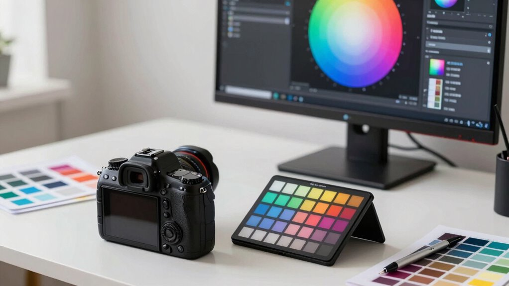
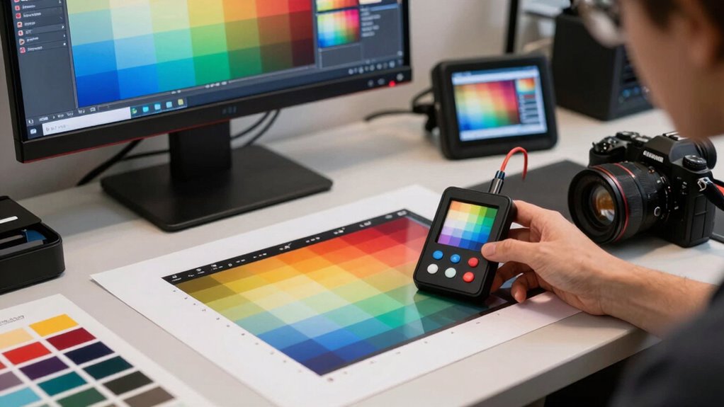
How to Calibrate and Profile Your Devices
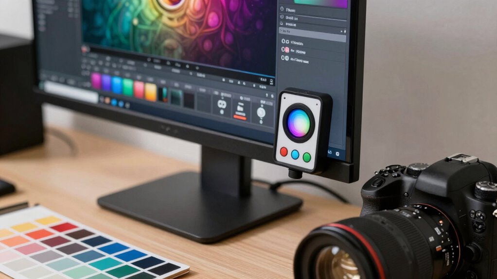
Calibrating and profiling your devices guarantees that colors appear consistent and accurate across all your workflows. Start with monitor calibration using dedicated tools to ensure your screen displays true colors. Use reliable color profiling tools to create precise profiles for your devices. This process adjusts your monitor’s settings to match standard color spaces, reducing discrepancies. For instance, understanding the horsepower of electric dirt bikes can help you select the right model for your off-road adventures. Here’s a quick overview:
| Step | Action |
|---|---|
| Select calibration tool | Choose a trusted hardware or software tool |
| Run calibration | Follow on-screen instructions for calibration |
| Create profile | Save the profile for your device |
| Apply profile | Set it as default in your OS or software |
Calibrating and profiling your devices is essential for consistent color accuracy.

Hach DR300 Pocket Colorimeter, Free + Total Chlorine LR/HR, LPV445.97.00110
PRECISE CHLORINE MEASUREMENTS – Accurately measures Free Chlorine (0.02–2.00 mg/L Low Range) and Total Chlorine (0.1–8.0 mg/L High…
As an affiliate, we earn on qualifying purchases.
As an affiliate, we earn on qualifying purchases.
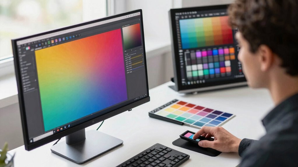
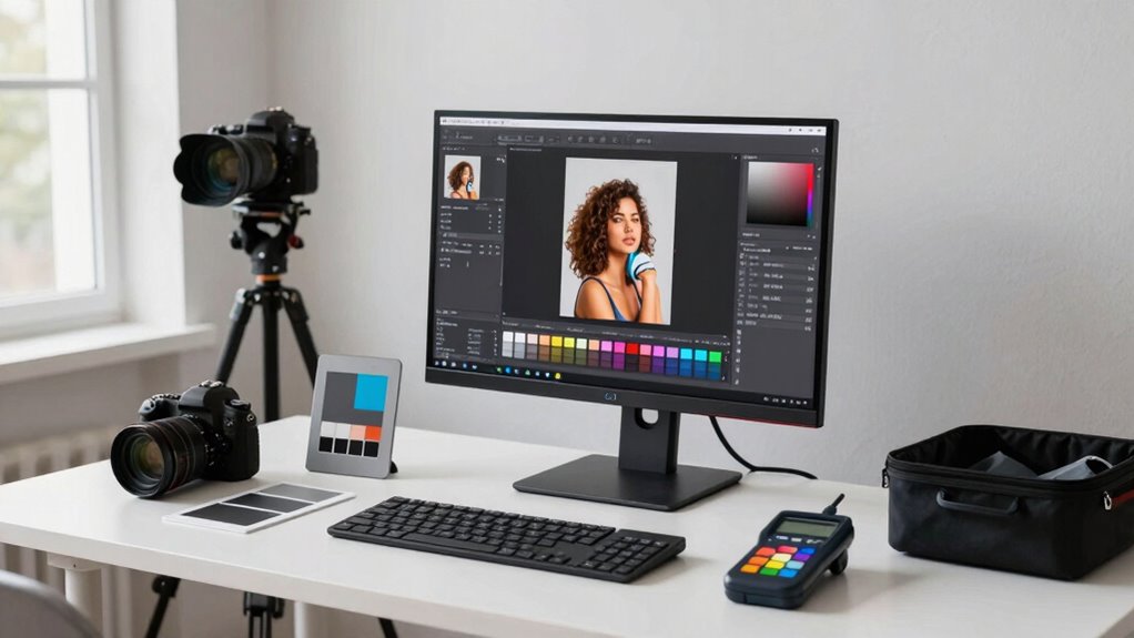
Choosing the Right Software and Color Settings

After calibrating and profiling your devices, selecting the right software and color settings guarantees your colors stay accurate throughout your workflow. To make certain of consistency, focus on these key steps:
- Choose software with robust support for monitor calibration to maintain accurate display colors, which is essential for a professional and reliable color workflow.
- Set your preferred color space, like Adobe RGB or sRGB, to match your project needs.
- Configure color management settings within your software to apply correct profiles automatically.
- Consider utilizing color management jobs to ensure your workflow remains consistent and reliable.
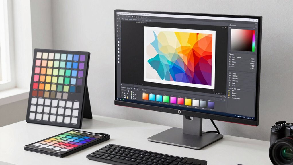
Applying Color Profiles to Your Files and Devices
To guarantee your colors stay consistent, you need to embed profiles correctly into your files and apply them to your devices. Regularly calibrating your equipment helps maintain accurate color reproduction, while managing your color space settings ensures your workflow stays reliable. Mastering these steps will give you confidence that your colors look just right across all platforms. Additionally, understanding how cabling solutions can impact your display calibration is essential for a seamless setup. Being aware of color management workflows can further streamline your process and ensure consistency at every stage. Recognizing the importance of monitor calibration can help prevent color drift over time, ensuring your setup remains precise. Proper hardware calibration is also crucial for maintaining consistent colors across different devices and displays, especially when considering color profiles and their correct application.
Embedding Color Profiles Correctly
Embedding color profiles correctly is essential for guaranteeing your images look consistent across different devices and platforms. Proper color profile embedding maintains color accuracy and prevents unwanted shifts during viewing or printing. To do this effectively, follow these key steps:
- Always embed color profiles during file export or save, especially in formats like JPEG, TIFF, or PSD.
- Use consistent color management workflows to ensure profiles are correctly assigned and recognized.
- Verify that your software supports color profile embedding and that profiles are embedded without corruption.
- Ensuring color consistency across devices is also vital for maintaining true-to-life colors in your images.
Calibrating Your Devices Consistently
Once you’ve embedded color profiles correctly, the next step is to guarantee your devices display colors accurately by calibrating them consistently. Monitor calibration ensures your display shows true colors, reducing discrepancies between your screen and the actual file. Regular calibration routines help maintain color accuracy over time, preventing drift. Use a hardware calibration tool to profile each device, creating precise device profiles that reflect its current state. These profiles help your software interpret color data correctly, leading to consistent results across different devices. Make calibration a routine, ideally weekly or monthly, especially if you work in color-critical projects. Incorporating color management workflows into your routine ensures better consistency and reliability. Consistent calibration and device profiling are essential for reliable color management, ensuring what you see on your screen matches your final output.
Managing Color Space Settings
Managing color space settings is essential for ensuring your images and designs display consistently across different devices and output methods. Proper profile implementation helps maintain color accuracy from screen to print. To do this effectively, focus on three key steps:
- Choose the right color space selection for your project—sRGB for web, Adobe RGB for printing, or others as needed.
- Apply the appropriate color profiles to your files, ensuring your software’s color management system recognizes and uses them correctly.
- Assign or convert profiles during editing to maintain consistency, avoiding color shifts when sharing or printing. Understanding dream symbolism related to clocks and time can also inspire creative approaches to visual storytelling.
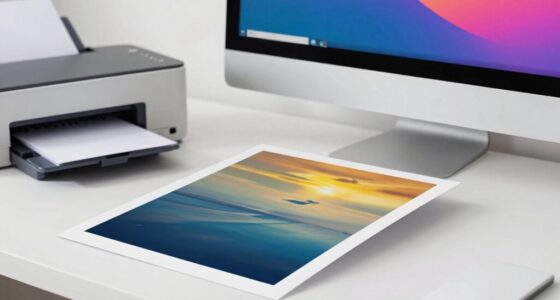
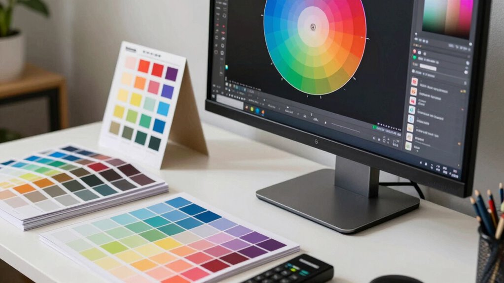
How to Keep Colors Consistent in Prints, Monitors, and Web
Maintaining consistent colors across prints, monitors, and web requires understanding how different devices interpret color. Your first step is regular color calibration, which ensures each device displays colors accurately and consistently. Calibrating your monitor aligns its color output with a standard, reducing discrepancies. For printing, use a color-calibrated printer and paper profile to match digital colors to physical output. When preparing images for the web, embed color profiles to maintain consistency across browsers and devices. Always check your color workflows with test prints and calibrated displays. Consistent color management minimizes surprises, so your designs look the same everywhere. By prioritizing color calibration and understanding device differences, you keep your colors true across all media.
Common Mistakes That Ruin Color Accuracy (and How to Avoid Them)
One common mistake that ruins color accuracy is neglecting proper calibration of your devices. Without regular color calibration, your monitor’s display can drift, leading to inaccurate colors. To avoid this, focus on these key steps:
- Skipping monitor profiling, which ensures your display’s color output matches industry standards.
- Using generic or outdated calibration settings instead of tailored profiles.
- Ignoring calibration frequency—your monitor needs recalibration as it ages or ambient lighting changes.
- Relying solely on automatic calibration tools without understanding color management principles to achieve consistent results. Additionally, understanding device calibration processes helps maintain color fidelity over time. Regular calibration routines and understanding color consistency are essential for maintaining accurate and reliable color reproduction across devices.
Verifying Your Calibration and Troubleshooting Color Issues
After calibrating your display, it’s important to verify that the calibration is accurate and consistent. Use hardware calibration tools or software to run validation tests, ensuring your monitor displays colors correctly. Check for color consistency across different parts of the screen and compare your results to known standards or color targets. If you notice discrepancies, recalibrate or adjust your settings accordingly. Troubleshoot common issues like color shifts, banding, or uneven tones by inspecting your calibration process and hardware connections. Regularly confirming your calibration helps catch drift over time, maintaining accurate color reproduction. This process can be streamlined by establishing calibration documentation, which helps you track changes and maintain consistency. Understanding requirements traceability can help you track calibration and troubleshooting procedures, ensuring compliance and quality standards are maintained throughout your color management process.
Simple Tips to Boost Your Color Management Skills
Enhancing your color management skills doesn’t have to be complicated; simple adjustments and consistent practices can make a significant difference. Focus on these key tips:
Improve your color management with simple adjustments and consistent practices for better results.
- Study color theory basics to understand how colors interact and influence perception, improving your ability to create balanced images.
- Master your printing techniques by calibrating printers regularly and choosing the right paper, ensuring accurate color reproduction.
- Use consistent workflows, such as applying the same color profiles across devices, to minimize discrepancies and streamline your process.
Frequently Asked Questions
How Often Should I Recalibrate My Devices for Optimal Color Accuracy?
You should recalibrate your devices at least once a month for maximum color accuracy. Regular calibration ensures consistent results and helps maintain device longevity by preventing unnecessary wear. If you work in a color-critical environment, consider more frequent calibrations, such as weekly. Keep in mind that environmental factors like lighting and temperature can affect calibration, so stay attentive to any color shifts that may indicate the need for recalibration.
What Are the Best Practices for Managing Color Profiles Across Multiple Devices?
Imagine you’re the captain steering a ship through fog; managing color profiles across devices is just as vital. You should regularly synchronize color profiles to guarantee device color consistency. Use consistent color profiles, calibrate devices routinely, and employ color management tools to streamline the process. This keeps your screens and printers aligned, preventing surprises in your final output, and ensures your colors stay true, no matter the device you’re working with.
How Do Ambient Lighting Conditions Affect Color Consistency?
Ambient light considerably impacts your color perception and can cause color inconsistencies. When your workspace has bright or uneven ambient light, colors may appear washed out or overly dark, making it hard to trust your monitor’s accuracy. To maintain color consistency, control ambient light by using neutral-colored lighting, reducing glare, and working in a consistent lighting environment. This helps guarantee your colors stay true across different devices and conditions.
Can Color Management Improve Print-To-Screen Color Matching?
Yes, color management can improve print-to-screen color matching considerably. By performing proper color calibration on your monitor, you ensure color accuracy, so what you see on screen closely matches the printed output. Using calibrated devices and color profiles, you create a consistent workflow that minimizes discrepancies. This way, you achieve reliable color consistency from digital to print, saving you time and reducing guesswork in your projects.
What Hardware Tools Are Essential for Professional Color Management?
You need essential hardware tools like a reliable monitor calibration device and a quality colorimeter for professional color management. Start with monitor calibration to guarantee your screen displays accurate colors, then choose a colorimeter suited for your workflow. These tools help you create consistent color profiles, making your print and screen outputs match perfectly. Invest in reputable brands to achieve precise results and streamline your color workflow effectively.
Conclusion
Mastering color management is like tending a delicate garden—you nurture each step with care, ensuring vibrant, true-to-life results. With patience and the right tools, you’ll cultivate consistency across devices and media, turning your creative vision into reality. Remember, a little attention to detail can turn even the most stubborn hues into a harmonious display. Keep practicing, stay curious, and watch your colors flourish beautifully, effortlessly blending art and precision.