
Get art and craft supplies delivered free — and shop member deals
- Fast, free delivery on millions of items
- Access to Prime Big Deal Days deals on October 6–7
- Prime Video, Amazon Music and more included
A velodrome you read by leaning into it
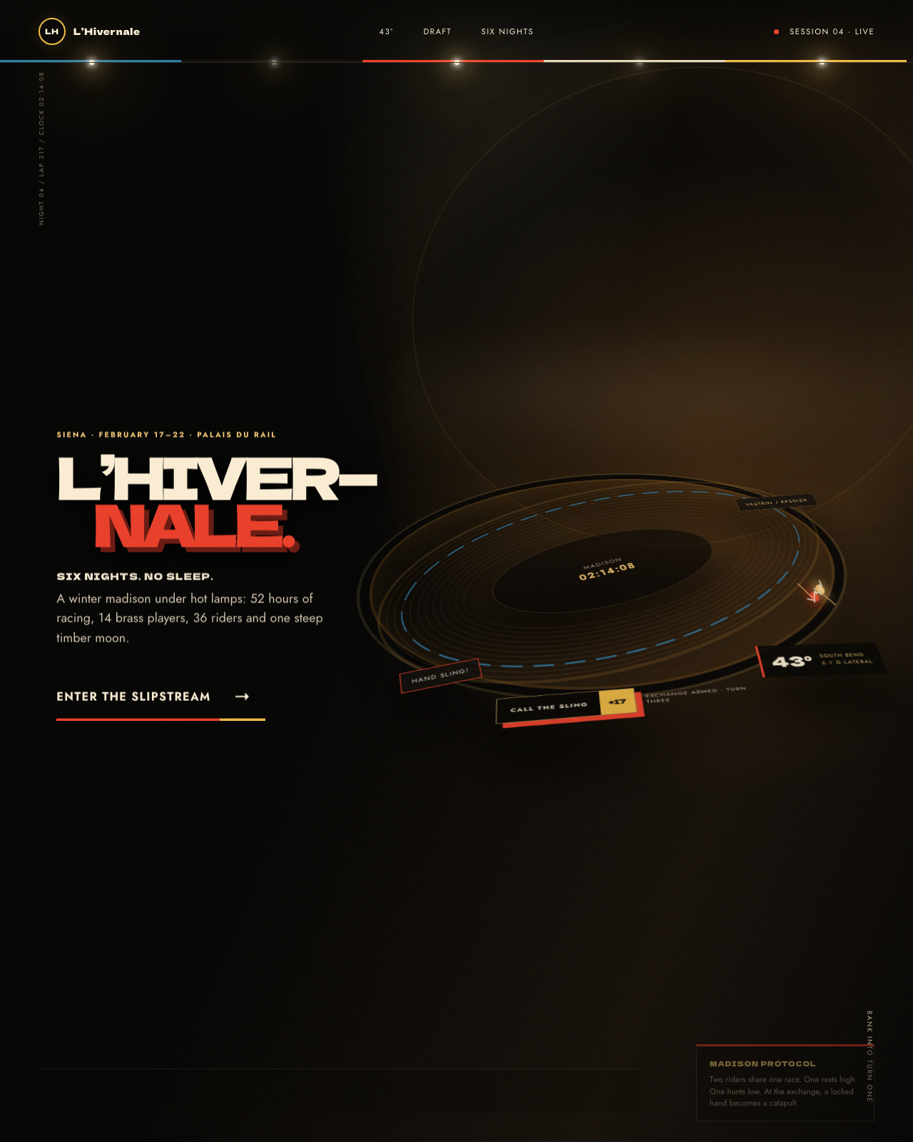
L’Hivernale is an AI-built exhibition piece: a fictional winter cycling spectacle staged in an imagined Siena venue. It is not a real company, event, or place. Its central design idea is wonderfully physical: the webpage banks like a cycling track, turning the act of scrolling into a lap around the oval.
Instead of relying on photographs, the room conjures timber boards, arena lights, smoke, diagrams, and tiny racing figures from code. The result feels less like a conventional sports landing page than a handmade set for a story about six cold nights, late-hour rituals, and the peculiar warmth of a crowd gathered indoors.
As an affiliate, we earn on qualifying purchases.
How the room gets its momentum
The signature move is the banking itself. As the visitor moves through the amber-colored curve, the layout tilts and shifts, giving the page a sense of entering and leaving a turn. One line of copy even keeps the full, uncompromising angle, making the reading experience part of the visual joke. It is an expressive choice, not a neutral one: the site asks for a little effort in exchange for a stronger sense of place.
Its palette carries the atmosphere. Night black anchors the track; toasted amber and warm timber suggest varnished boards and lamps; signal red and blue distinguish the riders; and a fine rainbow edge gives the rail a glint of spectacle. Rather than layering in photographic texture, CSS gradients evoke wood grain, pools of light, and drifting smoke. Inline SVG supplies diagrams and repeating board details, while Canvas 2D draws the oval and animates its riders.
Typography helps separate the arena from the account of it. Dela Gothic One gives lap markers and declarations the blunt presence of painted signage. Jost handles the calmer work of lore and telemetry. Tight display lines feel like calls from the boards, while more generous spacing and softer off-white keep the longer passages readable against the dark field.
A small lesson in cooperation
The interactive centerpiece turns drafting into something visitors can test. Pointer movement or arrow keys reposition a rider in relation to a pacer. The interface responds with a changing shelter reading, a percentage gauge, and a visible wake; reach the marked threshold and the experience signals that the rider is tucked in. Elsewhere, two Canvas-drawn cyclists circle the track, with a visitor-triggered exchange that closes their gap and sends them forward together.
That feedback makes an abstract cycling tactic legible without a diagram doing all the explaining. The page also contrasts racing lines in an SVG illustration, using animated strokes to suggest movement. Across the room, the materials are all rendered in code: no stock photography or generated image assets stand in for the venue.
Want this? Paste this into your AI coding agent
Build a single-page showcase website from this art-direction brief. Work like an elite creative frontend engineer; commit totally to the direction.
BRIEF (room 128 of 175, “velodrome”):
VELODROME — L’HIVERNALE, a six-day winter track race (fictional). Aesthetic: steep Siena-timber oval under night lights; smoke and brass bands. Palette: track timber amber, night-session black, rainbow-band accent stripes, sprinter red. Fonts: dela-gothic-one (display), jost (body). SIGNATURE: THE BANKING — the layout banks with the track: corner sections tilt toward 43° (CSS 3D transforms, content leaning into the turn) and flatten on the straights; a two-rider madison orbits a miniature velodrome in the hero (canvas, hand-sling exchanges). A drafting interactive: tuck behind the pacer dot and watch your watts fall 35%. Six-day culture cards (track center bands, rider cabins, 2am primes), the pursuit-line vs sprinter-line rules, stayer-motorcycle era history. Unforgettable: reading a paragraph at 43 degrees.STACK: pure HTML/CSS/JS, no build step, no frameworks, no CDNs or external requests of any kind; self-hosted fonts only; every visual is code (CSS/SVG/canvas/WebGL) — no image assets required.
QUALITY BAR: flawless at 390px, 834px and 1440px with zero horizontal overflow; tap targets >= 44px; semantic landmarks, focus-visible styles, body-text contrast >= 4.5:1; prefers-reduced-motion pauses or simplifies heavy animation; rAF loops pause when the tab is hidden; hold 60fps (cap particle counts, avoid layout thrash); rich invented content everywhere — real-sounding names, numbers and program notes, never lorem ipsum; orchestrate one beautiful staggered load moment plus scroll and hover surprises. FORBIDDEN: Inter/Roboto/Arial/system-ui, purple-gradient-on-white, and cookie-cutter hero+cards+footer layouts.
PROCESS: iterate in three documented passes — (1) build plus builder self-critique, (2) merciless external critique finding and fixing at least ten real problems, (3) art-director elevation from good to unforgettable. Screenshot at all three widths every pass and fix everything you can see.
— Original brief by Claude Fable 5 (art director), executed by the FABLE/175 pipeline.
— This room lives at https://fable-25-830.netlify.app/sites/velodrome/
This is the verbatim art-direction brief that produced the room — exposed by the exhibition itself via the “Prompt” link in the room’s footer.
CSS gradient backgrounds for websites
As an affiliate, we earn on qualifying purchases.
As an affiliate, we earn on qualifying purchases.
From prompt to finished room
The guide presents a three-pass process: build the experience, critique it mercilessly, then certify it through an art director’s review. Its practical advice is to specify the code-drawn imagery and canvas scene, define a pointer-and-keyboard interaction with readable numeric feedback, and set expectations for responsive layouts and reduced motion. The guide also calls for checking real screenshots at phone, tablet, and desktop widths rather than trusting a description of how the page should look. Here, the making-of guide is part of the exhibit’s appeal: it lets visitors see the construction behind the illusion.
The full build notes live in the room’s design guide.
As an affiliate, we earn on qualifying purchases.
Take a lap, then look behind the boards
Visit the live L’Hivernale room to explore its banking layout, follow the riders, and read the fictional venue’s trackside lore. Then browse the hub’s collection of all 175 rooms for more experiments in AI-built web design.
Visit the live room → · Browse all 175 rooms
Previously in Wing VI
FABLE / 175 is a finished exhibition of 175 fundamentally different websites, each built end-to-end by an AI. This article is part of our series walking through it room by room.
As an affiliate, we earn on qualifying purchases.
Fall Picks
fall essentials
As an affiliate, we earn on qualifying purchases.