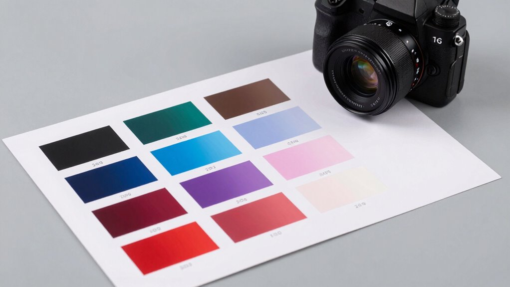
When accuracy in color reproduction matters, choosing the right color chart tool can make all the difference. The Pantone Formula Guide stands out as the best overall for its comprehensive color matching system suitable for print and packaging. For photographers and videographers, the Pixel Perfect Camera Colour Correction Card offers precise calibration in a compact form. Meanwhile, the Datacolor SpyderCheckr 24 provides excellent versatility for digital imaging. Often, the tradeoff comes between the scope of color coverage, ease of use, and budget. Keep reading for a detailed breakdown of the top tools and how to select the best one for your needs.

Get art and craft supplies delivered free with Prime
- Fast, free delivery on millions of items
- Prime Video, Amazon Music and more included
- Member-only deals all year
Key Takeaways
- The Pantone Formula Guide remains the industry standard for professional print and packaging color matching.
- Calibration tools like the DKC-Pro and Pixel Perfect excel in providing consistent color correction for photography and video.
- Color coverage and ease of use are often at odds: broader spectrum guides tend to be more complex but more versatile.
- Entry-level options like the Calibrite ColorChecker offer solid accuracy at a more accessible price point.
- Choosing the right tool depends heavily on your primary use case—print, digital, or multimedia—and your experience level.
| Pantone Formula Guide – Coated & Uncoated | Professional PMS Color Matching System for Print, Packaging & Graphic Design | GP1601B |  | Best Overall for Professional Color Matching | Colors: 2,390 Pantone solid coated and uncoated | Includes: Exact ink formulas, lighting indicator | Format: Physical chip book | VIEW ON AMAZON | See Our Full Breakdown |
| DKC-Pro 5″ x 7″ Set of 2 White Balance and Color Calibration Charts with Frame Stand and User Guide |  | Best for Digital Photography and Post-Processing | Size: 5″ x 7″ | Quantity: 2 cards | Gray References: 12% and 18% | VIEW ON AMAZON | See Our Full Breakdown |
| Datacolor SpyderCheckr 24 Camera Color Checker Chart with Grey Card |  | Best for Cross-Device Color Consistency | Color Targets: 24 spectrally engineered patches | Includes: Grey card | Size: Portable, compact | VIEW ON AMAZON | See Our Full Breakdown |
| Ultimate 3-in-1 Color Tool, Updated 3rd Edition | 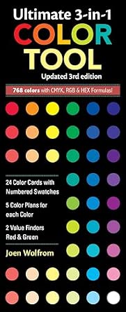 | Best for Physical Color Selection and Digital Formulas | Color Cards: 24 | Color Plans per Color: 5 | Formulas: CMYK, RGB, HEX | VIEW ON AMAZON | See Our Full Breakdown |
| Pantone Color Bridge Guide Coated | Pantone to CMYK, RGB & HTML Color Matching Fan Deck for Graphic Design, Branding & Print |  | Best for Digital and Print Color Matching on the Go | Colors: 2,359 | Includes: PMS, CMYK, RGB, HTML | Format: Color fan deck | VIEW ON AMAZON | See Our Full Breakdown |
| Pixel Perfect Camera Colour Correction Card – 4×6 for Photo and Video – Set of 2 |  | Best for On-the-Go Color Calibration for Photographers and Videographers | Quantity: Set of 2 | Material: SmartFlex Synthetic Paper | Finish: Matt coating | VIEW ON AMAZON | See Our Full Breakdown |
| Calibrite ColorChecker Classic Color Reference Target (CCC) |  | Best for Professional Color Profiling and Consistency Across Devices | Patches: 24 | Dimensions: 8.12 x 11.5 x 0.25 inches | Weight: 4.8 ounces | VIEW ON AMAZON | See Our Full Breakdown |
| color chart tools for accurate reproduction | Includes |
|---|---|
| Pantone Formula Guide | Exact ink formulas, lighting indicator |
| DKC-Pro 5" x 7" Set of 2 White | Color patches, gray references, frame stand |
| Datacolor SpyderCheckr 24 Came | Grey card |
| Ultimate 3-in-1 Color Tool | Red & Green value finders |
| Pantone Color Bridge Guide Coa | PMS, CMYK, RGB, HTML |
| Pixel Perfect Camera Colour Co | — |
| Calibrite ColorChecker Classic | — |
More Details on Our Top Picks
Pantone Formula Guide – Coated & Uncoated | Professional PMS Color Matching System for Print, Packaging & Graphic Design | GP1601B
The Pantone Formula Guide stands out as the definitive tool for precise color communication in print, packaging, and branding. Its inclusion of 2,390 solid coated and uncoated Pantone colors, with exact ink formulas, ensures consistency across multiple media, making it a must-have for professionals. Compared to the Pantone Color Bridge, this guide emphasizes spot color accuracy over digital matching, offering a more reliable reference for physical printing. The built-in lighting indicator helps verify proper viewing conditions, reducing color discrepancies. However, its high cost and bulkier format might be a drawback for casual or occasional users. Still, for agencies and print shops seeking industry-standard reliability, this guide delivers unmatched precision.
Pros:- Comprehensive 2,390 color options covering coated and uncoated finishes
- Exact ink formulas enable consistent print results
- Includes a lighting indicator for accurate color viewing
- Trusted industry standard used worldwide
Cons:- High price point may be prohibitive for small studios
- Bulkier format less portable than digital tools
- Limited digital compatibility without additional guides
Best for: Professional designers, printers, and branding agencies who need exact PMS color matching for print and packaging.
Not ideal for: Casual hobbyists or digital-only designers who rarely work with physical print materials, due to its price and size.
- Colors:2,390 Pantone solid coated and uncoated
- Includes:Exact ink formulas, lighting indicator
- Format:Physical chip book
- Application:Print, Packaging, Graphic Design
- Size:Can be bulky, portable options available
- Material:Standard print paper
Our verdict“This guide is ideal for professionals prioritizing precise physical color reproduction over digital convenience.”
DKC-Pro 5″ x 7″ Set of 2 White Balance and Color Calibration Charts with Frame Stand and User Guide
The DKC-Pro calibration charts excel at enhancing digital color accuracy, especially when used with software like Adobe Photoshop or Lightroom. Their 5×7 inch size makes them convenient for location shoots, while the inclusion of gray references (12% and 18%) ensures reliable white balance calibration. Compared to the Datacolor SpyderCheckr 24, these charts are simpler, focusing on core color patches and white balance rather than extensive spectrally engineered targets, making them more straightforward for quick calibration. The frame stand allows for stable setup, but their limited coverage might not suit high-end studio workflows. Ideal for photographers seeking easy, on-location color correction, especially when portability matters.
Pros:- Compact, portable 5×7 inch size
- Includes gray references for accurate white balance
- Easy to set up with frame stand
- Suitable for on-location and studio use
Cons:- Limited to basic color calibration, less spectral data
- Requires compatible software for calibration process
- Size may be small for some studio setups
Best for: Photographers and videographers needing quick, reliable calibration during shoots and post-processing.
Not ideal for: Advanced color professionals requiring extensive spectral data or camera calibration tools, as these are more straightforward references.
- Size:5″ x 7″
- Quantity:2 cards
- Gray References:12% and 18%
- Includes:Color patches, gray references, frame stand
- Use Case:Digital camera calibration
- Compatibility:Photoshop, Lightroom
Our verdict“This set offers a practical, portable solution for digital photographers focused on accurate post-shoot color correction.”
Datacolor SpyderCheckr 24 Camera Color Checker Chart with Grey Card
The SpyderCheckr 24 is a versatile, portable color calibration tool designed to create consistent color reproduction across a range of cameras and lighting conditions. Its 24 spectrally engineered color targets and included grey card make it a reliable choice for photographers and videographers aiming for uniformity, especially when shooting in varied environments. Compared with the Pantone Formula Guide, which targets print standards, the SpyderCheckr emphasizes digital accuracy and ease of post-production calibration, streamlining workflows for location shoots. Its compact design is a plus, but it requires compatible software for calibration, which may be a barrier for beginners. Overall, it’s a practical choice for those needing consistent color across multiple devices.
Pros:- Ensures color consistency across multiple cameras and lighting
- Portable and easy to carry
- Includes grey card for accurate exposure and white balance
- Simplifies post-production workflow
Cons:- Requires calibration software, which can be complex
- Limited to digital color calibration, not for lighting control
- Does not function as a lighting device
Best for: Photographers, videographers, and content creators needing reliable, cross-device color calibration on location or in studio.
Not ideal for: Users seeking detailed spectral data or those working solely in print, as it focuses on digital color consistency.
- Color Targets:24 spectrally engineered patches
- Includes:Grey card
- Size:Portable, compact
- Compatibility:Calibration software like SpyderX
- Application:Camera and light consistency
- Design:Portable with stand
Our verdict“This chart is well-suited for professionals needing consistent digital color across multiple cameras and environments.”
Ultimate 3-in-1 Color Tool, Updated 3rd Edition
The Ultimate 3-in-1 Color Tool offers a hands-on approach with 24 color cards, each featuring five color plans and red and green value finders. Its comprehensive formulas—CMYK, RGB, and HEX—make it versatile for both digital and print workflows. Compared with digital-only tools like the Datacolor SpyderCheckr, this set provides tangible, numbered swatches that facilitate quick, physical color selection and evaluation. However, its durability may be limited if heavily used, and it’s less effective for precise calibration than digital tools. This pick is best for designers who prefer tactile color reference guides for initial selection or quick checks, especially when digital calibration isn’t feasible.
Pros:- Includes CMYK, RGB, and HEX formulas for digital use
- 24 numbered swatch cards facilitate easy color selection
- Red and green value finders help evaluate color tones
- Physical, tactile reference for quick use
Cons:- Cards may wear or fade with heavy handling
- Not a calibration device—less precise for technical color matching
- Limited spectral information
Best for: Graphic designers and illustrators who favor physical color swatches for selection and reference, especially in creative brainstorming.
Not ideal for: Photographers or digital professionals requiring precise camera calibration or spectral accuracy, as it’s more of a reference than a calibration device.
- Color Cards:24
- Color Plans per Color:5
- Formulas:CMYK, RGB, HEX
- Includes:Red & Green value finders
- Material:Printed cardstock
- Use Case:Color selection and reference
Our verdict“This guide suits those who prefer physical color references for creative decisions over technical calibration accuracy.”
Pantone Color Bridge Guide Coated | Pantone to CMYK, RGB & HTML Color Matching Fan Deck for Graphic Design, Branding & Print
The Pantone Color Bridge Guide Coated offers a comprehensive, portable fan deck with 2,359 colors, presenting PMS, CMYK, RGB, and HTML values for seamless digital and print color matching. Its organized, chromatic order allows for quick comparisons, and the built-in lighting check ensures accurate color evaluation in varying environments. Compared to the Pantone Formula Guide, which is more print-focused, this guide emphasizes digital compatibility, making it a versatile choice for designers balancing both media. While its price may be steep for casual users, its extensive color options and convenience justify the investment for professionals needing rapid, accurate color referencing across platforms.
Pros:- Extensive color range with 2,359 colors
- Includes PMS, CMYK, RGB, and HTML values
- Portable fan deck with organized chromatic order
- Built-in lighting indicator for proper evaluation
Cons:- Expensive for casual or hobbyist use
- Requires proper lighting conditions for accuracy
- Physical deck may wear over time with heavy use
Best for: Graphic designers, branding specialists, and print professionals who need a portable, all-in-one digital and print color reference.
Not ideal for: Budget-conscious users or those working solely in digital environments without a need for physical color matching.
- Colors:2,359
- Includes:PMS, CMYK, RGB, HTML
- Format:Color fan deck
- Paper Weight:100 lb (148 gsm)
- Features:Lighting check tool, organized chromatic order
- Standards:G7 CRPC6 calibration
Our verdict“This guide is essential for professionals who need quick, reliable color matching across digital and print media, especially on the move.”
Pixel Perfect Camera Colour Correction Card – 4×6 for Photo and Video – Set of 2
This set of two correction cards is designed to provide a quick, portable solution for color accuracy in both photography and video. Made from durable SmartFlex synthetic material, these cards are lightweight and resistant to wear, making them ideal for field use. Compared to the Calibrite ColorChecker Classic, which offers a comprehensive 24-patch reference, this option focuses on simplicity and ease of use, though it might lack the extensive color data needed for detailed color grading. The included instructions and software facilitate straightforward calibration, but with a , some users report inconsistent results, potentially due to limited compatibility or ambiguous instructions. This pick makes the most sense for professionals needing quick, reliable adjustments during shoots, rather than detailed post-production work that requires extensive color profiling.
Pros:- Lightweight, portable design for on-location use
- Durable synthetic material resists wear and tear
- Simplifies achieving accurate white balance and color calibration
Cons:- Limited information on software compatibility and calibration precision
Best for: Photographers and videographers who need a portable, easy-to-use color correction tool for field use.
Not ideal for: Color grading specialists or those requiring detailed color profiles, as this tool offers limited color data and calibration depth.
- Quantity:Set of 2
- Material:SmartFlex Synthetic Paper
- Finish:Matt coating
- Dimensions:6 x 4 x 0.1 inches
- Item Weight:0.4 ounces
Our verdict“This correction card set suits mobile professionals needing quick, reliable color adjustments but isn’t ideal for detailed color grading workflows.”
Calibrite ColorChecker Classic Color Reference Target (CCC)
The Calibrite ColorChecker Classic is a staple for professionals who demand precise, consistent color reproduction across multiple cameras and lighting conditions. Its 24 scientifically formulated color patches provide a reliable reference for white balance, exposure, and color grading, surpassing simpler charts like the Pixel Perfect correction card in depth and accuracy. Compared with basic options, this target supports the creation of custom DNG and ICC profiles using Calibrite PROFILER software, streamlining multi-camera shoots and complex workflows. However, the software is sold separately, adding extra cost, and the effectiveness depends heavily on correct shooting technique under matching lighting conditions. This tool is ideal for commercial photographers, videographers, and post-production specialists who require consistent results, but less suited for casual or hobbyist users without the time or expertise to handle advanced profiling.
Pros:- Scientifically engineered patches for high accuracy across lighting conditions
- Supports creation of custom camera profiles with dedicated software
- Enhances workflow efficiency for multi-camera and commercial projects
Cons:- Software for profile creation must be purchased separately, increasing overall cost
- Requires proper shooting under matching lighting for best results
Best for: Professionals involved in multi-camera setups, commercial shoots, or detailed color grading who need dependable, repeatable results.
Not ideal for: Amateurs or hobbyists who prefer quick fixes over detailed calibration, since it requires proper lighting and software investment.
- Patches:24
- Dimensions:8.12 x 11.5 x 0.25 inches
- Weight:4.8 ounces
- Model Number:CCC
- Manufacturer:Calibrite
Our verdict“This color reference target is best suited for professionals who need precise, consistent color management across varied equipment and lighting scenarios.”
How We Picked
These products were evaluated based on their color accuracy, ease of use, build quality, versatility across different mediums, and overall value. Priority was given to tools that offer reliable, repeatable results for professional workflows while remaining accessible to serious hobbyists. The ranking reflects a balance between comprehensive color coverage and user-friendly features, with consideration for budget constraints. We aimed to highlight options that excel in specific use cases, ensuring readers get tailored recommendations for their needs.| color chart tools for accurate reproduction | Includes |
|---|---|
| Pantone Formula Guide | Exact ink formulas, lighting indicator |
| DKC-Pro 5" x 7" Set of 2 White | Color patches, gray references, frame stand |
| Datacolor SpyderCheckr 24 Came | Grey card |
| Ultimate 3-in-1 Color Tool | Red & Green value finders |
| Pantone Color Bridge Guide Coa | PMS, CMYK, RGB, HTML |
| Pixel Perfect Camera Colour Co | — |
| Calibrite ColorChecker Classic | — |
Factors to Consider When Choosing Color Chart Tools For Accurate Reproduction
Selecting the right color chart tool involves more than just brand names. You need to consider whether your primary focus is print, digital imaging, or video, as different tools cater to those needs. Ease of use can be a deciding factor if you’re new to color calibration, but professionals might prioritize comprehensive color coverage and accuracy. Compatibility with your existing workflow, whether it’s graphic design, photography, or packaging, also plays a critical role. Understanding these broader considerations helps avoid common pitfalls like underestimating calibration needs or choosing overly complex guides for simple tasks.Color Coverage and Range
The breadth of colors a chart can reproduce is fundamental for accurate matching. Professional-grade guides like Pantone’s Formula Guide provide extensive color options, making them suitable for high-stakes print work. However, broader coverage often means a larger, more complex tool, which can be less convenient for quick calibration tasks. If your work is more digital or multimedia-focused, a smaller, simpler chart might suffice, but ensure it covers key color spaces relevant to your projects.Ease of Use and Portability
Ease of use varies widely among color guides. Compact charts like the Pixel Perfect are designed for on-the-go use, especially in photography and video, but may lack the extensive color range of larger guides. Conversely, professional guides can be bulky and require training to interpret correctly. Consider how often you’ll need to calibrate—if frequent, a portable, user-friendly tool can save significant time and frustration.Calibration and Compatibility
Your calibration process must integrate smoothly with your existing equipment and software. Tools like the Datacolor SpyderCheckr are compatible with most camera and editing setups, making them versatile for digital workflows. On the other hand, print-focused guides are primarily for pre-press and packaging workflows. Confirm that your chosen chart can be easily incorporated into your calibration routines and software for consistent results.Build Quality and Durability
A color chart is only as reliable as its physical condition. High-quality materials prevent fading or warping over time, maintaining calibration accuracy. For professional environments, investing in sturdy, well-constructed guides ensures longevity and consistent performance. Cheaper, flimsy options might save money upfront but can compromise accuracy after repeated use.Cost and Value
Pricing varies widely — from affordable entry-level charts to premium professional guides. Balance your budget with your accuracy needs: if you only occasionally calibrate, a less expensive option may suffice. However, for critical work where color precision impacts your output, investing in a more comprehensive and durable tool provides better value in the long run. Beware of overly inexpensive guides with questionable color fidelity.Frequently Asked Questions
Can I use a color chart tool for both print and digital work?
Yes, many color chart tools are versatile enough to support both print and digital workflows. For example, guides like the Pantone Color Bridge are designed to translate colors between Pantone, CMYK, RGB, and HTML standards, making them suitable for both mediums. However, ensure the tool covers the color spaces relevant to your projects. If you primarily work in digital media, prioritize guides that include RGB and monitor calibration features.How often should I calibrate my color tools to maintain accuracy?
The frequency of calibration depends on your usage and environment. For professional workflows, calibrating your color tools and monitors weekly or bi-weekly ensures consistent results. In less demanding contexts, monthly calibration may suffice. Environmental factors like lighting conditions and exposure to sunlight can degrade color accuracy over time, so regular checks help maintain precision.Are cheaper color charts reliable enough for professional use?
While some budget-friendly options can provide decent accuracy for hobbyists or casual projects, they often lack the durability and extensive color range required for professional work. Cheaper charts may fade or warp over time, leading to inconsistent results. For critical projects, investing in a reputable, high-quality guide ensures more reliable calibration and consistent output, ultimately saving money and time.Should I choose a color chart based on size or portability?
Size and portability are important considerations, especially if you need to calibrate on location or in varied environments. Smaller, lightweight charts like the Pixel Perfect are ideal for on-the-go use, such as in photography or field work. Larger, more comprehensive guides are better suited for studio settings where space isn’t an issue. Balance your workspace constraints with the frequency and context of calibration tasks.What features make a color chart tool more user-friendly?
User-friendly tools often feature clear labeling, easy-to-understand instructions, and durable, non-fading materials. Some guides come with companion software or apps that simplify color matching and calibration processes. Portability also adds to ease of use, allowing quick setup and adjustments. Ultimately, a straightforward, well-constructed guide reduces the learning curve and enhances calibration consistency.Conclusion
For those seeking overall reliability and industry-standard performance, the Pantone Formula Guide remains the best choice. Hobbyists or budget-conscious users will find the Calibrite ColorChecker offers excellent value with solid accuracy. Professionals requiring comprehensive color coverage and durability should consider investing in premium options like the Pantone Color Bridge Guide. Beginners or casual users benefit from simpler, portable tools such as the Pixel Perfect Camera Colour Correction Card. Ultimately, selecting the right tool depends on your specific needs—whether print, digital, or multimedia—and your experience level.Fall Picks
fall essentials
As an affiliate, we earn on qualifying purchases.